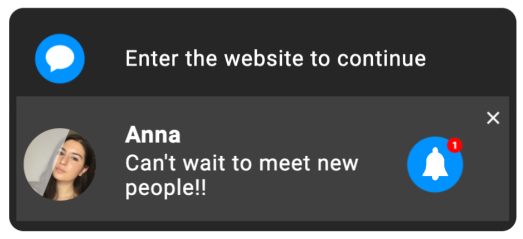
Marketers wanna market, and consumers get sick of it all. But it shouldn’t be like this! Social Bar ads came as a solution to this problem. Affiliates and advertisers can now provide native and engaging ad messages that will appeal to users combatting banner fatigue.
Social Bar has proved to outrun web push notifications in CTR: advertisers enjoy up to 30X higher click-through rates. And now it’s your turn to give it a try.
Read this article to unlock the best Social Bar campaign practices.
We also have a detailed SB campaign setup guide for you.
Why do users need alternative ad experiences?
Along with ad fatigue comes decision fatigue. Experts estimate we have to make some 35,000 decisions daily. And watching banners is not our primary life goal. However, Statista has found that users appreciate ads that deliver tailored experiences. So, if you can communicate your message in an engaging yet personalized way, you’re the market winner!
Social Bar has embraced all techniques needed to appeal to users:
- Non-trivial designs
- Totally OS and device-native templates
- Fast load
- UX-friendliness
- Attention-grabbing hooks and techniques
Social Bar comes with over 20 out-of-the-box templates and almost unlimited customization capacities. Let’s examine how advertisers and affiliates can easily tune up creatives to generate massive leads and conversions.
The power of Social Bar’s creatives
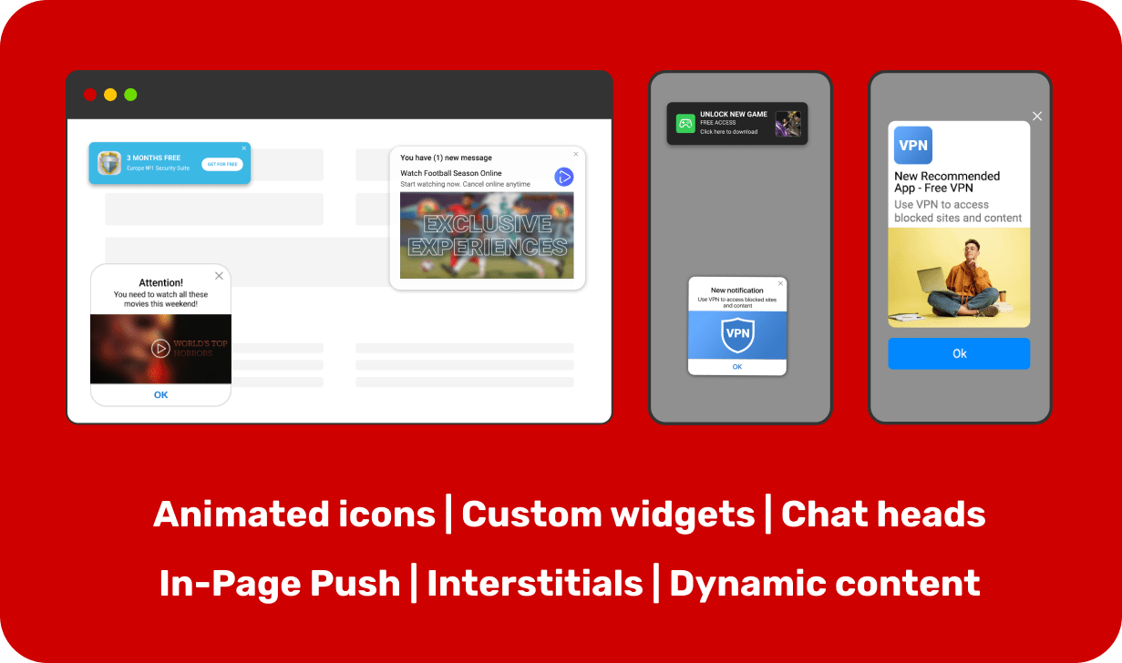
Social Bar has embodied the preferences of your digital-native customers. It comes with several interactive templates available out of the box, and you will only need to upload your images and add texts. Templates contain several skins and styles that make your offers totally unique.
All visuals have proved to convert highly on Adsterra traffic. Let’s learn a bit more about them.
Once you log in to Adsterra as an advertiser, you can pick one of the up-to-date templates:
- In-Page Push — your creatives will look like OS messages or push notifications from social networks.
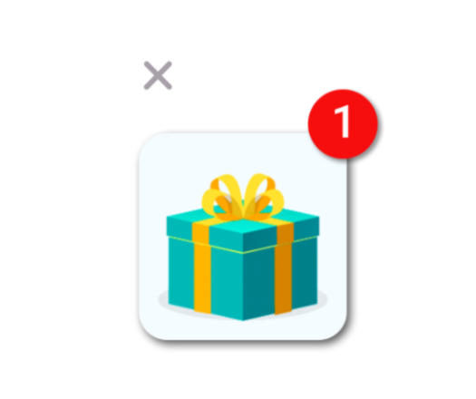
- Icon Notifications — animated icons with or without a chat bubble that interact with users and invite them to click.
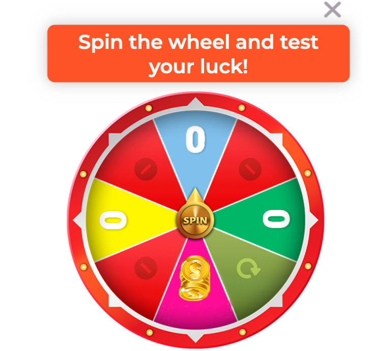
- Custom Widgets — eye-catching static or dynamic widgets with powerful CTA buttons that boost click-through rates.
- Interstitials — full-screen advertisements that cover the page’s content with a large and engaging message.
In-Page Push
An alternative to web push, the In-Page Push format doesn’t require user subscriptions. Ads are served to desktop and mobile browsers including iOS-based devices.
You can choose classic notifications that will remind those sent by Windows, MacOS, iOS, and Android. Or, carry on with hit templates that look exactly like messages from social networking platforms.
In-Page Push ads best practices
- No visual clutter or extra details
- One object on a picture/icon
- High-quality images
- High contrast (icon VS background)
- Clear messages with call to action (for VPNs, Utility, Software)
- Teasing messages with call to action (Dating, Sweeps, iGaming)
- The core value stated in the message
- Clear CTA if you use a template with a button
- No misleading
Icon Notifications
These are all kinds of chat heads you might have seen on Facebook or other messaging platforms. Icons look neat but catchy on all devices. The “1 new message”, pulsation, and other effects grab user attention from the first seconds they load the page. You can add a text bubble for more impact, and the creative will become truly interactive.
Icon Notifications best practices
- Best for Dating offers, but also hit with VPN and iGaming verticals
- High-quality icons with no extra details
- Icons that contrast background convert better
- Informal language for Dating offers works best
- It is worth translating texts to local languages (if targeting France use French)
- Teasing or informative messages work better than salesly headings
- Teasing works, misleading does not
Custom Widgets
Though they are called “custom,” these are also templates that you can adapt to fit your offer perfectly. You have a set of pre-designed widgets where you can place ad copy and a triggering CTA. If you need to sound native to iOS users, pick the template with no button, packed into a light or dark theme.
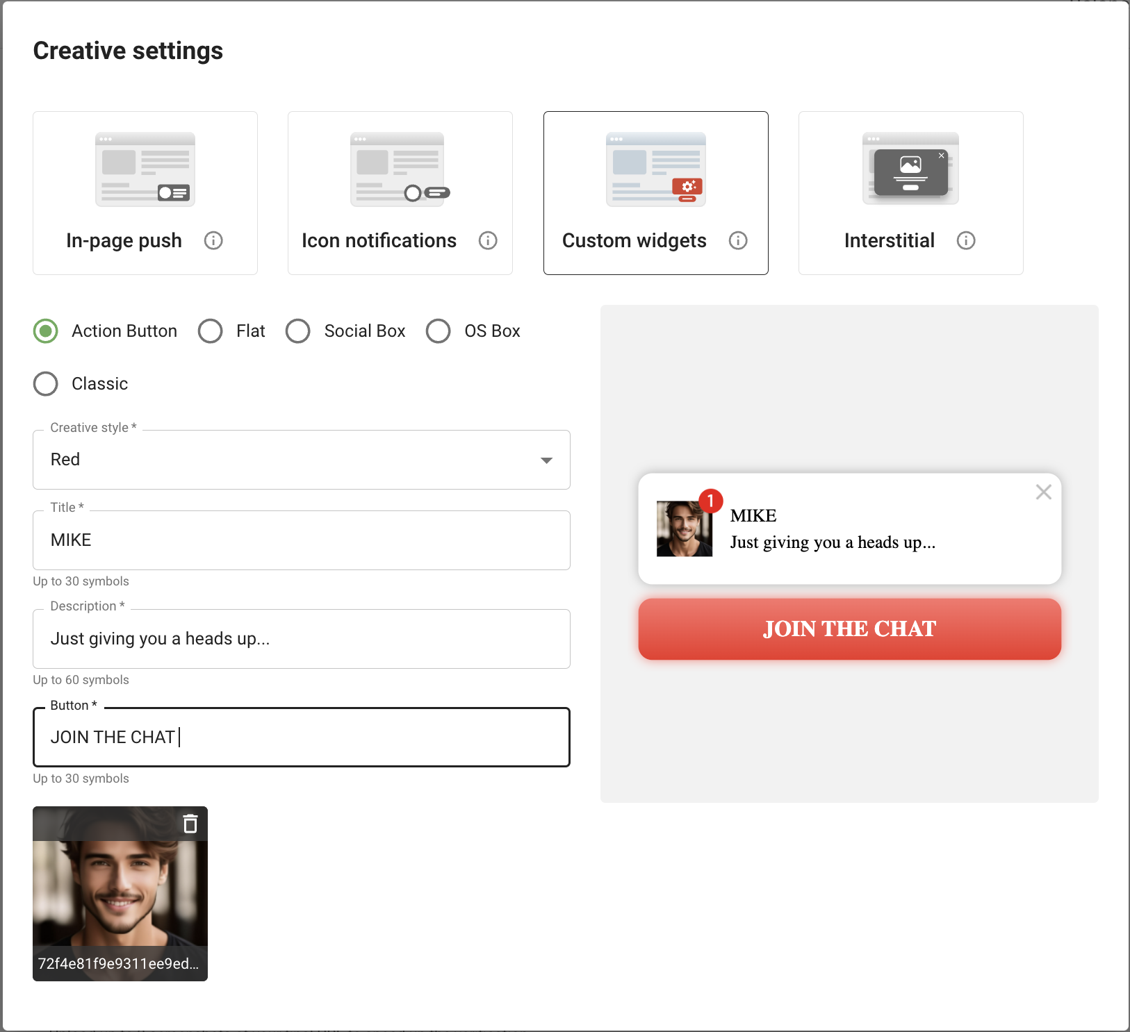
Custom Widgets best practices
- Clear CTA on buttons (“TRY,” “GET,” “GET FREE____,” not “GO TO WEBSITE” or “LEARN MORE”)
- Short headings that state value
- Neat and simple designs for iOS
- Icon colors should either match or contrast the CTA button color
- High contrast (icon VS background)
- No misleading or urging
- Translate texts to local languages
Interstitials
An Interstitial is a full-screen ad message that appears over the interface of a website page. They are often called “revenue doublers” as they’re impossible to ignore. These ads are displayed both on desktop and mobile devices, looking neat and native.
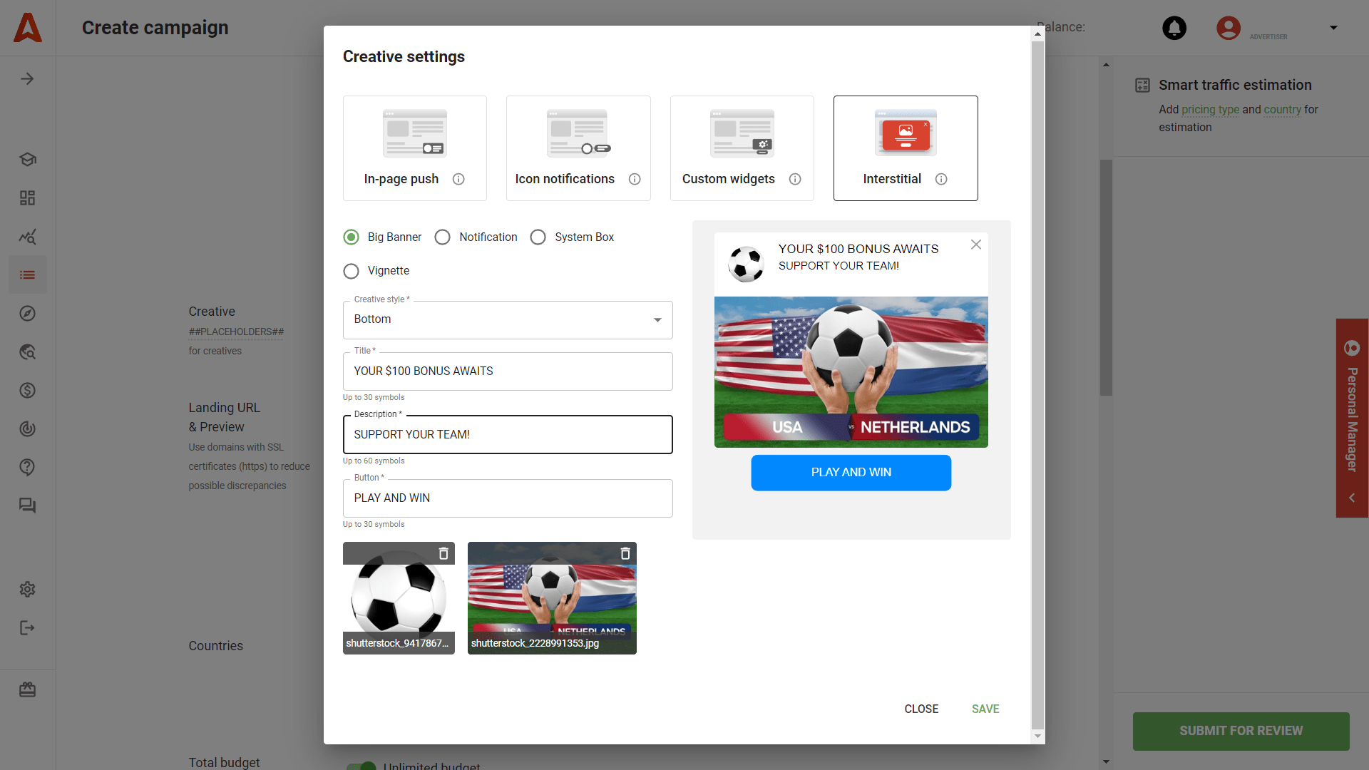
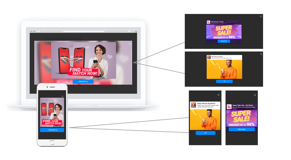
Interstitials best practices
- To attract customers, use different skins/templates
- Offer discounts, bonuses, and bargains
- Add texts to the main image
- Amaze, tease, and shock, but stay honest
- Appeal to real values and numbers, but don’t mislead
- Limit your by time when possible.
Launch stellar Social Bar campaigns with these traffic slices
When you enter a new ad network, it’s great when you have a cheat sheet with top traffic slices to start with. We updated the list of most ROI-boosting GEO+Device+Traffic Type bundles so that you can explore Social Bar ads with them.
Mobile (iOS)
- USA – VPN, Utility, SignUp
- Japan – VPN, Utility
- Thailand – E-commerce, VPN
- Germany – VPN, Utility, Dating
- France – VPN, Utility, Dating
Mobile (Android)
- USA — Utility, Dating, SignUp
- India — Utility, VPN
- Indonesia — E-commerce, Utility, Sweep
- Brazil — Utility, Binary, Antivirus
- Philippines — Ecommerce, Binary, Notification
- Germany — Dating, Utility, VPN
- Nigeria — Utility, Binary, Antivirus
Desktop (macOS)
- Top GEO: USA, United Kingdom, Germany
- Top verticals: Software, Add-Ons
Desktop (Windows)
- USA — Software, Add-Ons, SignUp
- Germany — Add-Ons, Software
- France — Add-Ons
Expert tips for best in-page push and display Social Bar campaigns
#1. Define how your target audience consumes information
Think of your audience’s behavior patterns. It might seem corny, but if you don’t know exactly how your users consume content, you’ll probably throw your money away. Are they used to messaging apps and in-app alerts? Are they familiar with push notifications, browser extensions, Instagram stories? On what OS and devices are they more likely to be found?


#2. Start with a more transparent conversion flow
If you’ve just started advertising with Social Bar, our advice will be ‒ the simpler the flow, the better. Choose offers with a fast and smooth conversion flow on your affiliate network; it’ll be easier to assess the results. What flow could it be?
For Software, Utilities, Apps, Games – an app install or a game trial.
For Dating, Sports, iGaming – SOI (single opt-in) or DOI (double opt-in).
#3. Use several creatives during A/B tests
You can upload up to 15 creatives, and we recommend using at least four (the more, the better). That would make your life much easier when you start collecting data and weed out those creatives with poor click-through rates.
When testing visuals, try not to change the texts. But make sure the visuals differ a lot; it is better to use different skins. When you want to see what heading/trigger converts best, work with text content, avoiding radical design changes.
#4. Be consistent in design and messages
You now have unlimited opportunities to design creatives on your own (on managed accounts) or choose between 20 ready-to-use templates. Any shapes, animation effects, behavior are possible. But will they match the landing page you lead your users to?
The connection between a lander and a creative must be clear to your audience. You nearly pitch the offer with Social Bar, so users agree to buy it, and if they don’t get what they expect on a lander, they’ll leave.
#5. Put conversions, not CTR, first
One big trap you may fall into is getting high CTRs and poor conversions. This problem stems from the inconsistency of the initial creatives and the offer itself. You can’t mislead users by offering something they won’t get (like a fake free trial). Conversions will also drop if your creatives look much better than the final landing page (see tip #4) or stream visuals unrelated to the product (e.g., when you place a wrapped gift icon but lead to an offer without any gifts or bonuses).
#6. Don’t underestimate simple and neat designs. They work!
Exploring something new and versatile, you might find yourself torn apart between settings and designs. By adding your icons and texts, you make them unique but don’t waste time on extra tests and exclude risks. Simplicity and value are the best tandem for a successful campaign.
Real-life customized creatives that gained lots of conversions
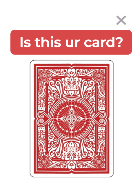
One of the Social Bar’s powers is customization. This option is available to all advertisers who own managed accounts. Adsterra either provides you with turn-key ready designs or uploads those you prepared.
Some catchy and CTR-boosting examples will speak better than words. Let’s find out why they’re so effective.
Now it’s your turn to rock with Social Bar
Seriously, with your Self-Service Platform, you can create and launch a test campaign with any of those 20 awesome styles for ad creatives.
After the registration:
- Choose Create Campaign.
- Find the AdUnit category and pick Social Bar.
- Choose the CPM, CPC, or CPA Pricing model (you don’t need to put funds immediately, but you will have to top up your account after the verification).
- Now move to the Creatives section and tweak any templates, skins, and styles you fall for.
It’s time to create your next stellar campaign 

