The homepage is an integral part of any website because it’s often the first page visitors see, and come across ads. So, literally, first impression is priceless. How will you get people to read your content, watch ads, and subscribe to your newsletter if your blog homepage isn’t attractive and engaging enough?
We’ll discuss various homepage design options for your blog, and some best practices for increasing conversions and ensuring your homepage serves its purpose.
The purpose of a blog homepage
The blog’s purpose is to help people solve problems while also earning money for the author. It is uncommon for a blog to be run solely as a journal, without considering the needs of the target audience or the goal of making profit.
Your blog’s main landing page has four main functions:
- Attract and hold your visitors’.
- Inform users about your business.
- Encourage users to explore your articles.
- Convince people to sign up for your email list.
- Promote sponsored content or monetize your efforts with ad codes.
Your homepage must be user-friendly because it serves as a gateway to your content, projects, and products. Creating a blog homepage layout requires proper planning and thoughtful design, so here’s some guidance on design ideas.
Different types of a blog homepage
By default, the homepage usually displays an index of your most recent articles, with a sidebar depending on which theme you’re using.
The traditional blog homepage lists blog posts in reverse chronological order: either in whole or just excerpts, with pagination across the bottom to read more. Many early blogs didn’t have a menu because they didn’t have any additional pages, so navigation wasn’t necessary.
Traditional homepages have a few issues because the content constantly changes after publishing new posts. There is no static content for search engines to index, so your best content disappears quickly, and the content at the top is your latest, which may not be the best experience for new visitors.
Traditional blog homepage
The traditional blog homepage lists blog posts in reverse chronological order: either in whole or just excerpts, with pagination across the bottom to read more. Many early blogs didn’t have a menu because they didn’t have any additional pages, so navigation wasn’t necessary.
Traditional homepages have a few issues because the content constantly changes after publishing new posts. There is no static content for search engines to index, so your best content disappears quickly, and the content at the top is your latest, which may not be the best experience for new visitors.
Static homepage
A static homepage is the opposite of a traditional blog homepage. It’s a homepage style with fixed static content that doesn’t change synchronously after publishing new content.
The static homepage looks and feels more like a traditional website. However, a modern blog homepage is more likely to mix static and dynamic content.
Hybrid blog homepage
A new blog homepage layout that combines traditional and static homepages elements to achieve the best display of content. It involves mixing static elements with your most recent articles on the first page. It also allows Google to index the static content and purpose of the blog while ensuring the homepage stays current after publishing new content.
Upside down homepage
The upside down homepage is a hybrid blog homepage with one significant difference: It has a large hero area that appears like a fat footer but is only visible at the top.
The goal here is to ensure that users view your most important call-to-action first.
How to structure your blog homepage design
When building your homepage, consider the structure and the necessary information you’ll provide for your visitors before thinking about your logo and the color of your buttons. These days, many bloggers create custom dynamic homepages that highlight specific posts or categories, integrate their social media feeds, and make it easy to buy their recommended products.
Static blog homepage vs. featuring recent posts
A homepage displaying recent posts in reverse chronological order (newest first) is ideal for a regular visitor. They’ll be checking your blog regularly for new content. That’s fantastic, and you certainly want your most recent articles to be easily accessible, but what about more unknown visitors?
Rather than just displaying your most recent content, highlight a few popular posts that you consider “recommended reading” for new visitors to your blog or provide a list of categories from which they can choose to find the most relevant content.
Elements to add in your blog homepage design
Your business determines your choice, but here are some design elements to consider for your homepage:
Recent posts
Recent posts are vital for search engines and your readers. They expect to easily find your recent content when they return to your blog. If your blog homepage is not static, it replaces older content with the most recent posts on your homepage. You can use a Recent Posts plugin to display older headlines and contents of your recent blog posts.
Categories
Blog categories help readers navigate your website and get the information they need. They’re broad topics that make it easier for visitors to understand your blog’s purpose and find the content that they want. The categories organize your site’s content by grouping individual posts and sub-topics into several main categories. Blog categories facilitate content planning and improve SEO.
Popular posts
For some reason, your most popular posts are the most successful pieces of content. You can increase trust, increase social proof, and encourage visitors to stay longer on your website by displaying these popular posts on your homepage.
Information
Your homepage should include a mailing address, email address, and possibly a phone number, commonly found in the footer where visitors should be able to find your contact information quickly.
Integrating social media links and live chat information for urgent inquiries is a good idea.
Social media links
Your social media accounts aid in the distribution and amplification of your content. Although most social media sites use no-follow links, it increases your chances of reaching someone who will reference it and use a follow link. Building high-quality links for your social media profiles helps them rank higher in search results, promoting traffic that benefits your overall business reputation.
Navigation
Your homepage navigation’s design and content can impact your website’s conversion and bounce rate. To reduce bounce rate, give your visitors a clear path to the pages they need from the blog homepage.
Use a hierarchical structure to organize the links and make the navigation menu visible at the top of the page. Include a search box if possible.
Email list sign up
Email is still one of the most effective ways to communicate with your audience. Adding an email subscription option on your blog increases your chances of boosting your ROI and click-through rates. Subscribers to your email list are more likely to share your content.
A well-designed subscription form can double the base of passive income from sponsored advertising. Learn more: With These 15 Tactics, You’ll Get Email Subscribers Faster
Instagram feed
Sharing engaging content on Instagram can help your business grow. There are numerous advantages to integrating an Instagram feed into your blog. Instagram can be a nice place to grow your followers and readers at once because it has over 1 billion daily active users.
Latest youtube videos
If you have a youtube channel, it’s worth adding space for your latest video on the blog homepage. This strategy is particularly effective because brief videos generate the most engagement, and you can share your summary on YouTube with a link to the full version.
Twitter feed
Twitter is a powerful social networking tool and search engine to find fresh information on any topic. By embedding tweets on your website with a Twitter Timeline, you can help drive more traffic to your Twitter, improve brand awareness, engage your audience, build personal relationships with your followers, boost conversions.
Ads and sponsored products
Sponsored content generates revenue better because it’s a type of native ad that does not feel like a random sales presentation, which makes consumers more responsive. Ads and sponsored content have higher visibility on a blog’s homepage, leading to higher CPM rates. Publishers can also use sponsored content to engage readers further (via videos or infographics) and form a stronger bond with them.
Blog homepage layout ideas
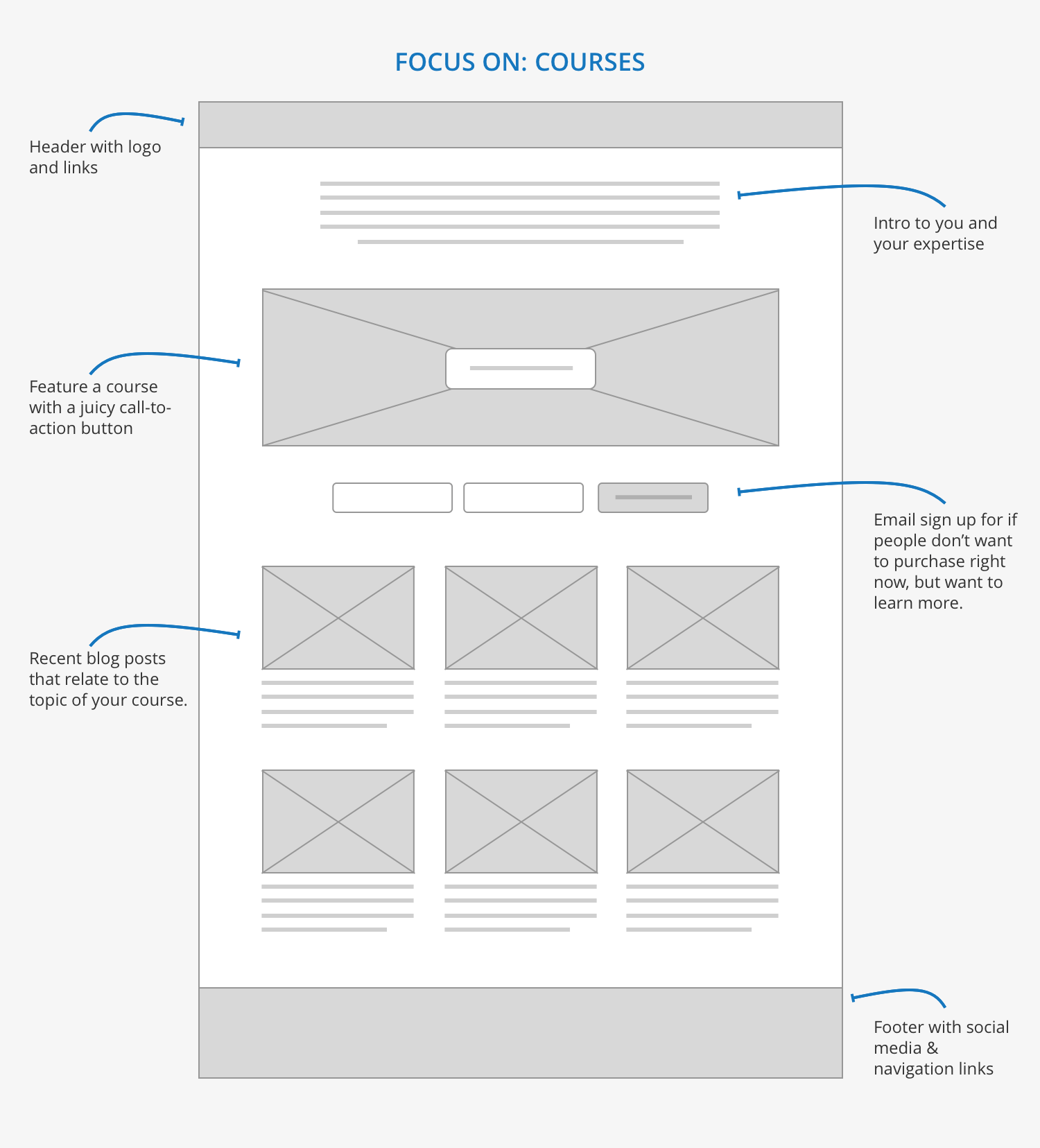
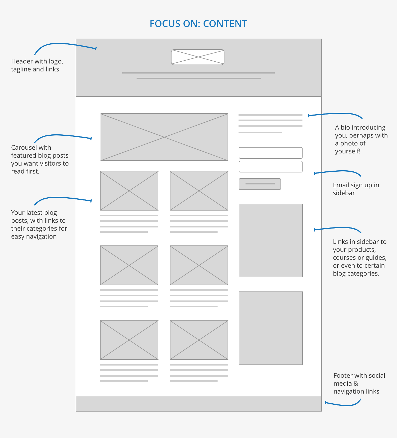
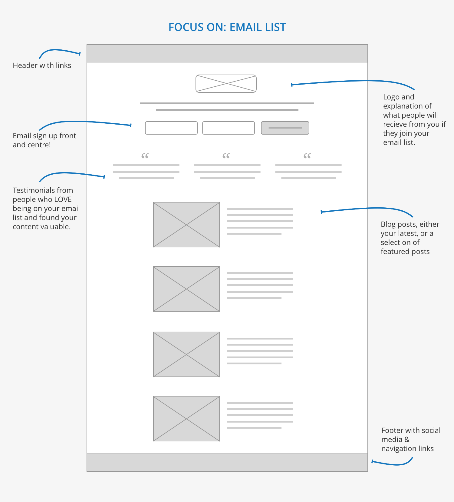
Decide what content is the most important, then design the page (see our guide about Blogger), so your primary call to action is noticeable. Here are three distinct blog homepage design ideas to get you started, each with a particular focus.
1. Focus on courses
2. Focus on content
3. Focus on email list
Where is it appropriate to place ads on the main page?
It all depends on the blog homepage template. If you have a slider at the top, then a banner in the header will already be out of place.
But if your homepage resembles The Guardian, The Telegraph, NYT, then a 728×90 banner in the header will look great.
Banners will appear out of place if you have large article covers or video previews on your blog. Therefore, placing an advertising code that is not visible on the page but loads a new landing page with ads in a separate browser tab is better.
Here is our article about advertising formats, their pros, and cons: High-Paying Ad formats for Publishers — Adsterra 2022
Examples of blog homepage design from the pros
Looking at what the experts are doing is one of the best ways to create a successful homepage.
1. Affiliate Valley blog
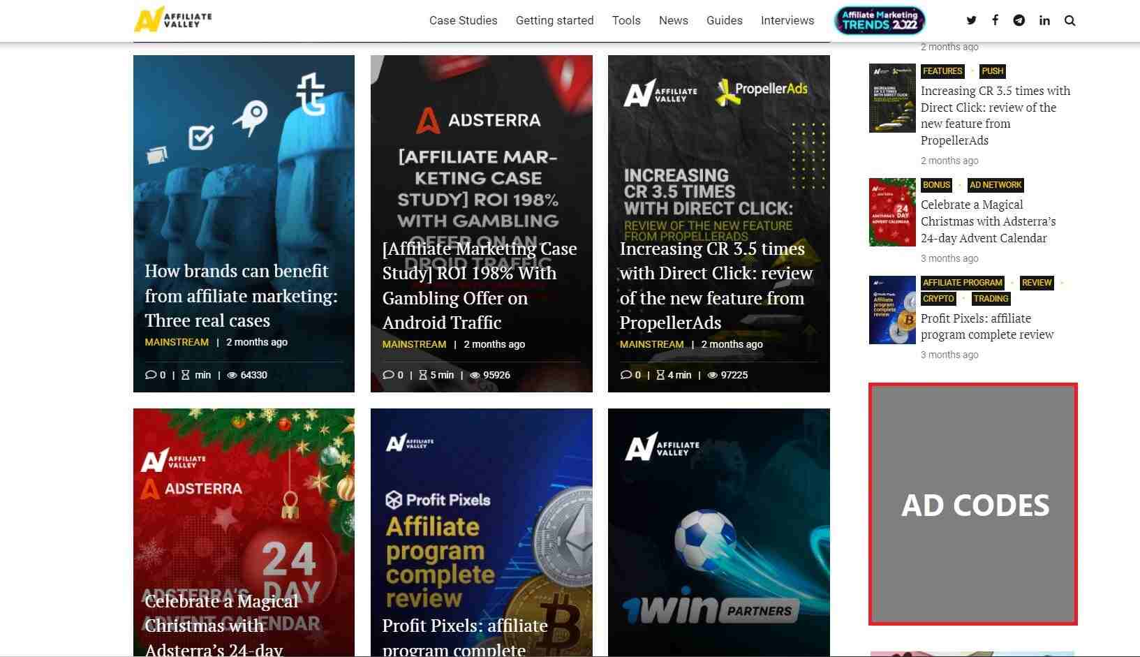
Here the main focus is on applied cases and expert advice. Therefore, the website itself is made up of blog covers of case studies and reviews. There is a place for an ad block on the sidebar, but the design focuses on native texts and articles that the company writes in collaboration with its partners.
2. Blogging Eclipse
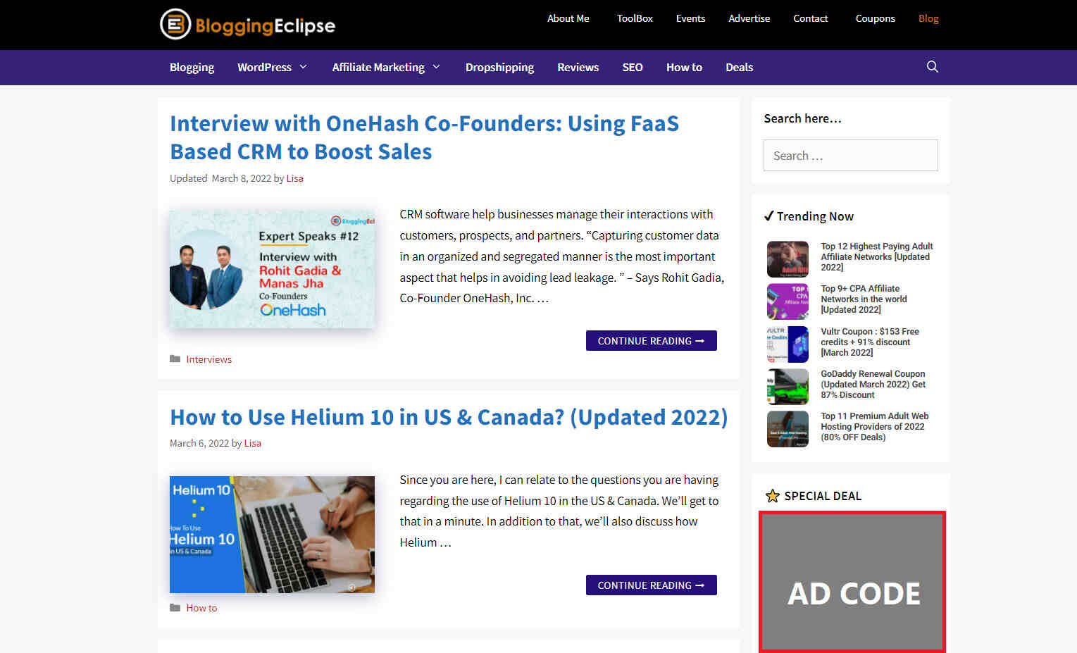
Blogging eclipse’s homepage has a classic structure with small advertising space for special deal partners. The main focus is expertise materials, and each has a block with a cover and a brief description. There is a Trending Posts block that generates additional clicks from their blog visitors (trending posts are often sponsored).
3. Help Scout
The best blog designs are sometimes the most plain. Help Scout, a company that makes customer service software has a unique but minimalist design on its blog that we like — it uses a lot of white space and limits the use of copy and visuals.
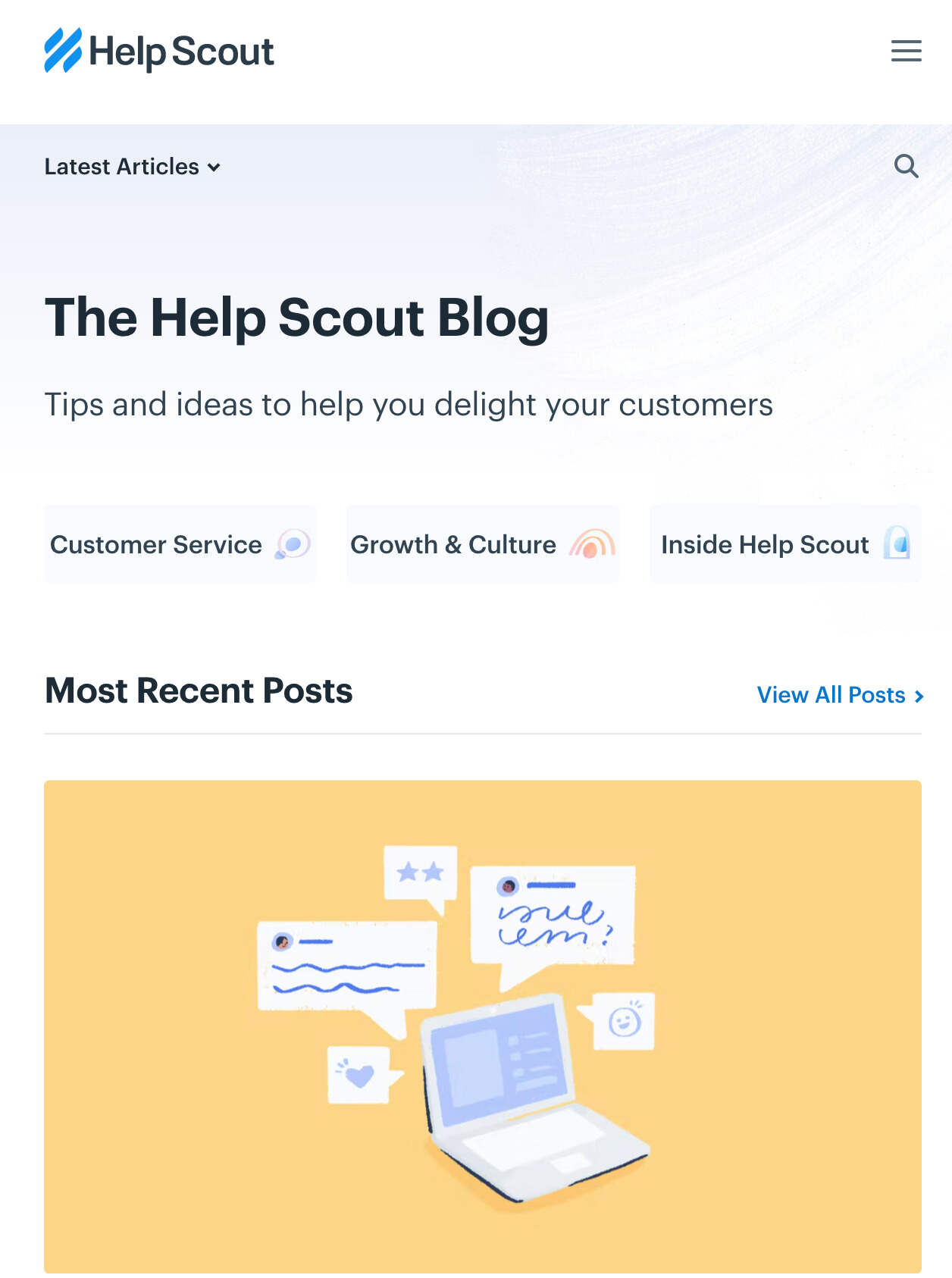
This blog’s use of featured images for all posts, including a banner at the top that highlights a recent or viral entry, is something we particularly admire. These icons are placed in front of bright, block colors to draw the reader’s attention and indicate the topic of the post. It works because the design of this blog indicates “clean” and “readable.”
4. Backlinko
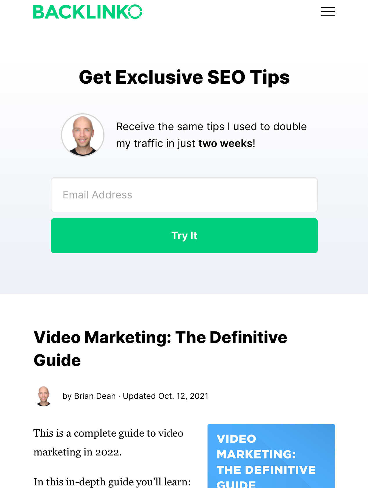
They have a unique and straightforward approach to creating effective landing pages for clients that get results. They call it an “inverted home page.”
Why does it work?
- First, the only goal for this homepage is to convert visitors into email subscribers. When you take a close look, there are five different calls to action on the homepage serving that purpose.
- Second, there aren’t any navigational buttons. Backlinko removed and placed them in the footer to avoid possible friction.
- They also employ stories to capture website visitors’ interest, leading to a significant call of action.
5. Smart blogger
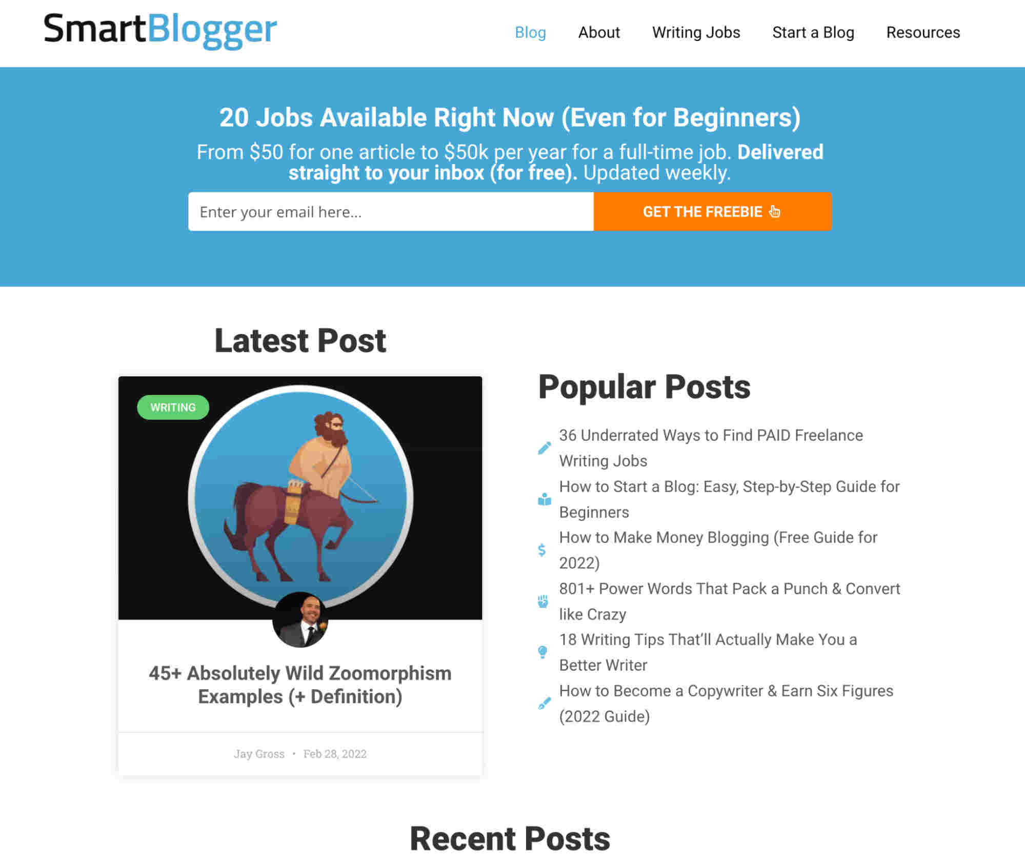
You don’t need to hire an expensive web designer to design your homepage. At least not when you’re just starting. Your homepage’s primary objective should always be:
- Gaining a new email subscriber
- Establishing trust
You’re ready if your homepage accomplishes those two goals.
Why does it work?
Their homepage isn’t beautiful. However, the feature box focuses on how Smart Blogger grows its mailing list by creating an irresistible lead magnet to increase the email list.
This blog design accomplishes its objective impressively. When visitors first arrive, they expect to see content, which this homepage provides immediately.
Conclusion
When someone comes to your blog for the first time, their main goal is to find the information they need and locate it quickly. Remember the 10-20 seconds rule? – it’s the amount of time an average visitor will spend on your website before clicking the ‘back’ button, and that’s not much of a chance to make an excellent first impression. But with a clear value proposition and structure, your blog homepage design can hold visitors’ attention much longer. For these reasons, rather than just promoting your most recent few posts, maximize your homepage potential by including quality ad formats and sponsored posts that will earn you revenue and entice visitors to stay longer.
