Affiliate marketing requires a lot of creativity since there is no single formula for running a successful campaign. It starts with attracting organic or paid traffic via blogs, emails, social media, ads, etc.
The next step is directing this traffic to a well-designed landing page that must convince them to convert: taking specific action such as leaving their contact details, making a purchase, using a discount, and so on.
Creating such an effective landing page, squeeze page or lander on your own is problematic and time-consuming. But with landing page builders, you can unleash your creativity to develop jaw-dropping sites and make your audience convert.
This article highlights the top page builders for affiliate marketers and best practices for creating high-converting affiliate landers.
What is an affiliate landing page?
Affiliate landing pages are dedicated web pages designed specifically for a marketing campaign. It is the page that your visitors “land on” after clicking on an external link like an ad creative or affiliate link. Unlike other pages that can serve multiple purposes, this page is designed with a single goal in mind — to persuade the visitor to convert immediately.
Still, an affiliate lander aims to get as many good leads as possible to your offer to increase conversions. Affiliate marketing is rarely successful with just one type of traffic or marketing channel. It often looks for prospects in a lot of different places. This means you must ensure your landing page is optimized for traffic from various sources, like organic search, paid ads, email newsletters, and social media.
We’ll talk about how to make an affiliate marketing offer page that works well for everyone, and we’ll give you some affiliate marketing landing examples so you can see how they work.
To Contents ↑Affiliate landing page examples
Here are some great examples of impressive offer pages to give you ideas.
1. Olymp trade: Finance and trading
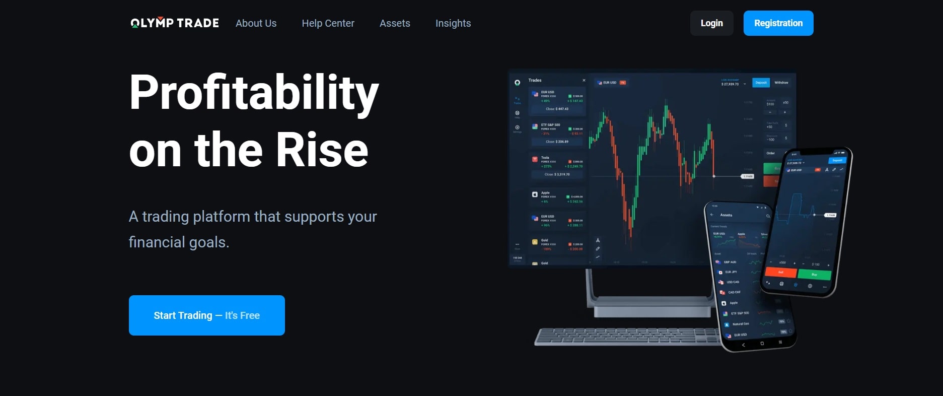
The page clearly describes what it is offering and for whom, and it is immediately clear that registration is free.
What can be improved? The menu buttons lead to other pages, distracting the visitor from performing the target action. This is acceptable for a huge industry giant like Olymp Trade, but if you’re creating a product landing page, it’s best to avoid adding other links besides the CTA button. All FAQs are best placed directly on the lander, closer to the footer.
2. Victoria Hearts: Dating website

The photographs in the background change, and you can see different genders, races, and nationalities represented. This maintains the image of an international social communication platform.
The lander is mobile-friendy or responsive. And the lead generation form on the first screen is conveniently-placed and understandable.
What can be improved? There are no unique selling propositions (USP), but this is not too important because the brand is a long-standing player in the market, and many people recognize it. However, if you are not marketing offers for well-known brands like Victoria Hearts, you must add some USPs to convince visitors.
Furthermore, the benefits of registering are barely highlighted on the page, and there are no real user reviews either.
3. Académie du Développement Personnel

This is a landing page for a training course. In addition to a usual text description on the first screen, they’ve featured a persuasive video.
This is an excellent approach because we live in a visual world, and more people are willing to learn through video. For example, TikTok, a platform for short videos, has been the most downloaded app in the world for the past 12 months.
Videos can also convey a lot of information quickly, which is beneficial to users with reading or visual impairments. When adding a video to your lander, ensure that it is clear, sharp, and short enough not to bore users. You should also host it on an external platform like Vimeo, YouTube, or even Coub to avoid slowing down your LP’s page load speed.
The webpage also has a prominent call to action, further describing the benefits of joining for visitors who chose to ignore the video. There are video reviews and summaries with photographs of students who have completed the course.

Each training module and the materials included in it are described in detail. There is a special offer with a discount, and all payment transfer methods are listed. By providing enough information to keep visitors on the webpage, they’re reducing bounce rates and removing doubts about the course. Visitors are more likely to convert when all the questions they could possibly have are answered as they scroll down.
What can be improved? It’s difficult to create such a landing page if you don’t work for the company whose product you’re promoting. Therefore, you need to understand exactly that your income will cover your expenses, including temporary ones. For example, if you have experience preparing landers and found a great offer with a RevShare payment model, then you should try it. Otherwise, look for something simpler.
Even a perfect lander doesn’t guarantee high revenues. The offers you choose to promote greatly impact your success. Selective, high-paying CPA offers are waiting for you at Adsterra CPA Network.
To Contents ↑Best practices for creating high-converting affiliate landing pages
Here are some expert tips for building high-converting landing pages.
1. Set a single conversion goal
Remember, a landing page does not have to be your homepage. Do you want it to encourage people to buy a product? Subscribe to an email list? Define your goal and ensure everyone who visits your landing page understands it. Depending on the offering, a single landing page should work for one product or category of products.
2. Your creatives and lander should match
To get the most out of your ad campaign, ensure the lander is relevant to what you advertised. This is crucial since it is deemed unethical to use irrelevant pre-landers to attract irrelevant traffic. The consistency of the entire design should be consistent: colors, icons, logo
Also, when it comes to USPs and messages, promising a 20% discount in a creative and a 5% discount on a landing page is a bad idea. Specifying a different expiration date for a promotion, for example, is another sure way to lose conversions.
3. Your landing page should be concise and complete
Remember that digital customers have a short attention span. Include only the required information on your landing page and keep the design simple. Only use bold text for emphasis when necessary.
If your product is complicated, create a FAQ section accessible via a link — don’t try to include all answers in your main copy. Expect and respond to the questions users are likely to ask.
4. Avoid directing ad traffic to your homepage
We don’t recommend directing traffic from your promotional campaigns to your website’s home page. In general, a home page is jam-packed with information, and there are usually many different actions from which a visitor can choose. They may become distracted on the home page and fail to take critical action.
5. Use direct CTAs
When adding a call to action button, it’s best to use a legible font, distinguishable color, and appealing design. Highlight the only action you want the visitor to take. Make sure to place the form or button at the bottom of the page again if the lander is long enough to scroll.
6. Get rid of everything extra
Eliminate distracting navigation links, your main website menu, etc. Remove all unnecessary clutter from the landing page, such as buttons, links, and menus unrelated to the current ad campaign, except for WATCH VIDEO buttons.
7. Include social proof
Customers rarely make a purchase based solely on one person’s opinion. They go through review websites to read customers’ thoughts and examine customer-submitted product images.
You must include social proof (like reviews or metrics) to keep customers on your landing page and provide them with all the information they need to convert directly on the lander.
For example, metrics such as “1,000,000+ installs” and “98% ratings” indicate that other people have had success with this product.
Here are some more social proof tips for your affiliate landing page:
- You can screenshot compelling reviews and add them directly to your lander if the website’s terms of service permit it.
- Sharing your experience with words like “in my experience,” “personally,” and “personal recommendation” is compelling.
- Statistics, studies, and ratings can help customers feel confident that they are about to make a wise, data-backed purchasing decision.
- If your advertiser has a section with testimonials on their site, you can safely copy them to your landing page.
8. Make your landing pages fast and responsive
Optimize your website so that it adjusts to fit all devices’ displays, so everyone gets the best user experience on your website regardless of the device or browser they use.
Visitors may not always have the patience to wait for a landing page to load. As a result, make sure your page loads quickly. Google Page Speed can help you measure your load speed and get suggestions on improving it.
Why do you need a landing page builder?
Without a landing page builder, you won’t be able to launch and improve your affiliate marketing campaigns quickly or on a large scale: It takes too much time, skill, and money to make and test custom landers without one.
Using a landing page builder makes life much easier for every marketer:
Cut expenses with code-free designing
Hiring web developers to create a beautiful landing page can cost you hundreds of dollars. But lander builders can help trim this expense. They often provide a simple interface and come with dozens of professionally designed and optimized templates. Anyone can build and publish a landing page, not just web developers.
Drag-and-drop interface
A landing page builder typically provides a simple drag-and-drop interface and allows you to edit each element as you see it. Essentially, whatever you see on your lander while editing is what you will see when you publish it. With a builder, you can change everything from the fonts to the colors to the layout. Divi allows you to edit your pages in real-time and see the final result before hitting the publish button.
Split testing
Landing page builders cut the time it takes to create a landing page. They also provide tools like split testing to help you test various landers and see which one has the better conversion rate.
In-built analytics tools
Instead of just tracking goals in Google Analytics, you can easily measure conversions in a single dashboard.
What should you look for in a landing page builder?
How can you choose the best landing page builder for your needs when there are so many to choose from? We think you should judge landing page builders based on these factors.
- User-friendly interface: You’re not going to code your pages by hand, so you’re using a landing page builder. So your landing page tool needs to be easy to use—it shouldn’t make your life harder.
- Available templates: A good landing page builder should provide many templates you can change to suit your needs instead of leaving you to come up with your own lander designs (though you can still do that if you want to!)
- Conversion testing: Not only do your landing pages have to look nice, but they also have to work. Check to see if the tool has features like A/B testing and heatmaps that can help you improve your conversion rates.
- Custom domain: Most people want their landers to have a unique domain. This should be possible with a good landing page tool, and you shouldn’t have to pay extra for it. But this doesn’t always happen, so you should consider this point when choosing one.
- Pop-ups and a form builder: You’ll want to collect leads, so it’s essential to have a good form builder with options for custom fields. Pop-ups are another excellent way to get the visitor’s attention.
- Free trial: Landing page builders’ prices vary quite a bit, so you should check out what each builder has to offer before making your decision. With some free trials, you can even try out the pro features.
Top 10 landing page building platforms for affiliate marketers
1. LanderLab
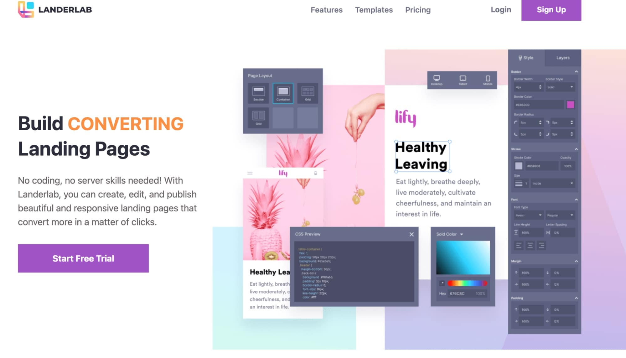
LanderLab is one of the most sophisticated lander builders currently available. Over 100 ready-to-use templates are available for various verticals, including E-commerce, Nutra, Finance, Lead Generation, and more. Additionally, you can upload the .zip pages saved on your computer or directly import landers from spy programs like Adplexity.
It doesn’t matter how skilled you are at editing; there is a built-in visual editor that makes the process incredibly simple and doesn’t require any technical knowledge. Of course, you can create a brand-new landing page from scratch using an empty template.
To Contents ↑2. PureLander
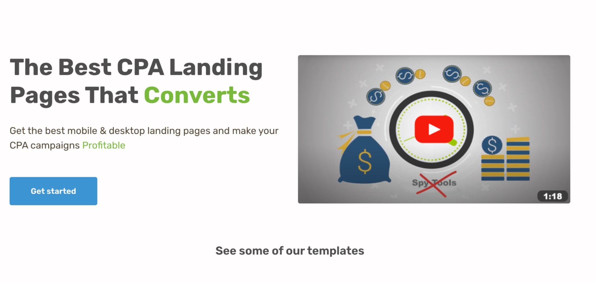
PureLander provides more than 150 easily editable and customizable templates. Suppose you can’t find what you’re looking for in their inventory. In that case, you can download and modify any lander you require using a landing page ripper or importer.
There are many extra features in PureLander that enable you to add scripts that increase click-through rates, including a back button hijack, countdown timer, exit pop, vibration, Javascript alert, timed redirect, audio alert, and others. You can also add custom scripts if you know how.
These are only a few of the features that PureLander provides, and even those aren’t its best ones. You can have access to all of that functionality for just $25 for a six-month subscription.
To Contents ↑3. ClickFunnels
For more experienced affiliates, ClickFunnels is the go-to website and funnel builder. This tool might be a bit overkill if you’re running sweepstakes, but if you’re running Nutra offers, it might be just what you need to get some extra conversions.
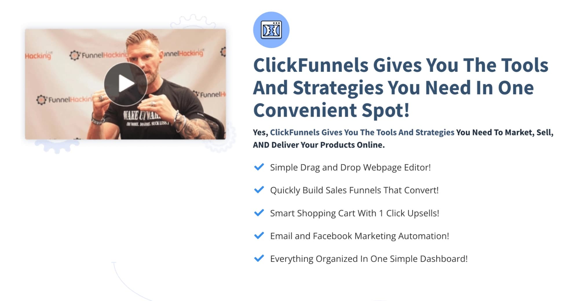
With Clickfunnels, you can create landers from scratch and incorporate them into an effective sales funnel. It has a straightforward drag-and-drop editor and offers the ability to gather emails, make tests, or guide customers through the purchasing process. Additionally, you can customize your mobile optimizations precisely. ClickFunnels is ideal for more complex verticals like E-commerce offers or Nutra campaigns.
The most affordable ClickFunnels subscription plan costs $97 per month, while the most expensive one costs $297. Additionally, for a monthly fee of $2,497, they provide an extremely expanded plan for agencies and super affiliates.
To Contents ↑4. LeadPages
LeadPages is the ideal option for non-technical affiliates. You don’t need to be a geek or web developer to fully use this tool’s features. You can quickly create and publish web pages using the drag-and-drop builder.
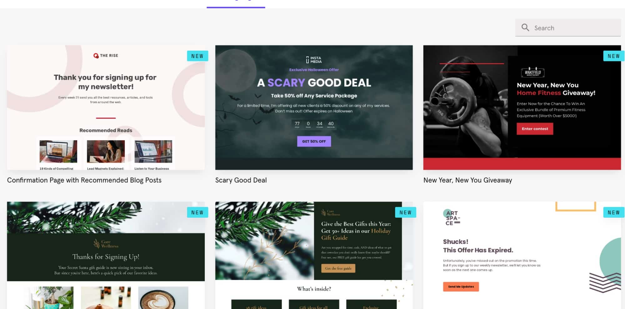
Other features of LeadPages include simple conversion optimization for all of your content, a variety of Popups, alert bars, and ease of A/B testing, which can make your initial traffic testing phase much more enjoyable.
There are more than 200 high-converting templates available for you to pick from. You also have access to an analytics dashboard that shows how visitors interact with your landing pages.
Pricing starts at $37 per month for a standard plan, $79 for a pro plan, and $321 for an advanced plan, including unlimited page publishing, leads, and traffic.
To Contents ↑5. Convertri
Convertri’s most notable feature is its rapid loading time. You probably know how crucial it is to have your fast-loading landers. And this seems to be the tool’s top priority. Additionally, you have complete control over your landers with the editor. You can create unique pages without using grids or columns.
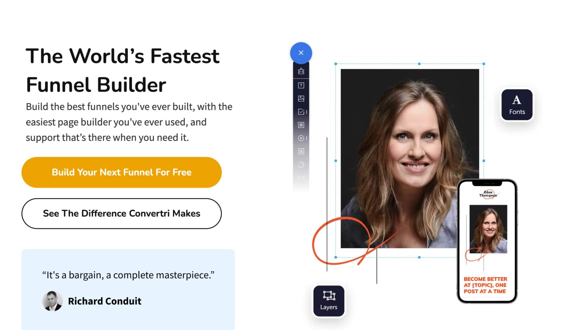
Convertri also provides a ton of pre-made headers, footers, forms, and features. After you’ve built a few landers, you can build collections and a library of building materials to simplify your subsequent builds. A dynamic text replacement, on the other hand, allows you to use the same webpage for various offers, ads, and keywords they contain.
Convertri costs $99 per month and includes split testing, mobile conversion optimization, page importer, and many other standard features.
To Contents ↑6. Wizzi
Wizzi is yet another premium lander builder that anyone with only basic technical knowledge can use. They offer a simple user interface, insightful performance tracking for the lander, and quick loading times.
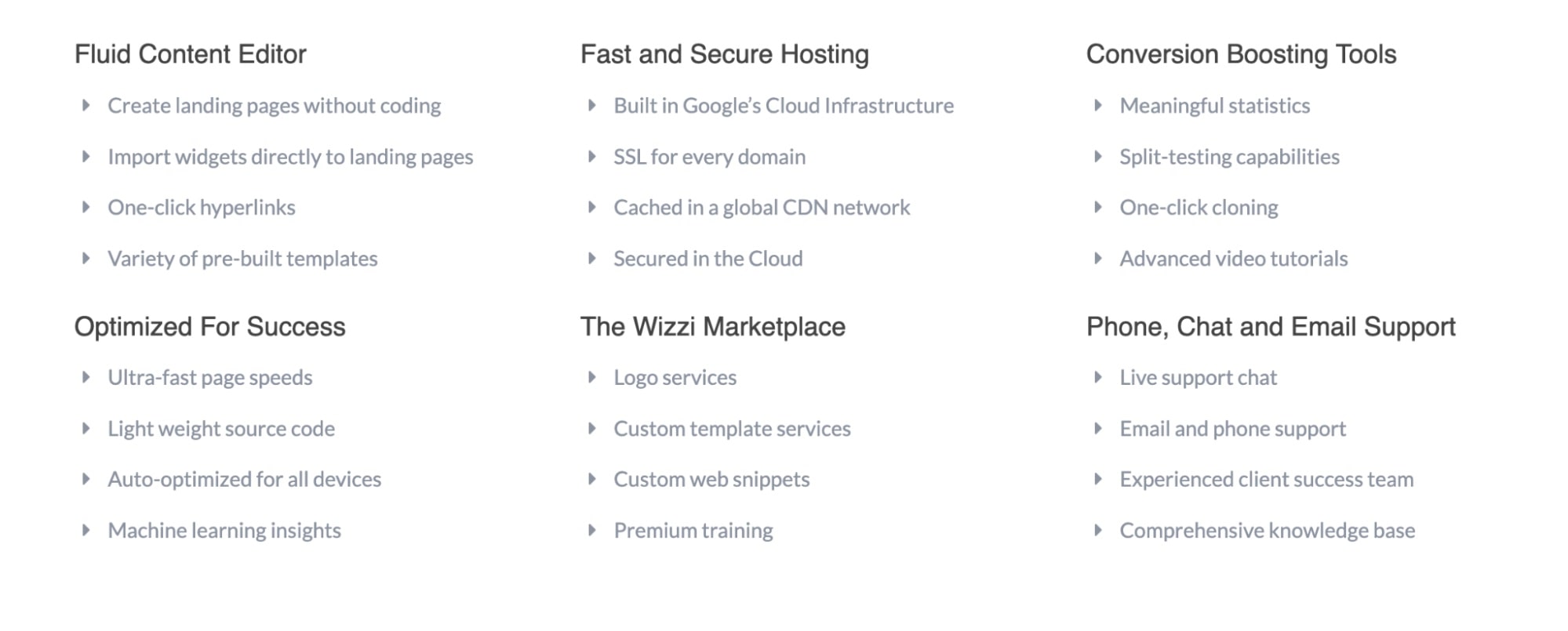
Since its infrastructure is built on Google’s Cloud Platform, it offers virtually limitless potential for growth and scaling along with a quick and dependable system. Your pages can be completely customized in the editor and automatically optimized for all devices. You can rely on comprehensive documentation, video walkthroughs, and on-demand technical support if you encounter any problems.
Wizzi integrates quickly with other platforms, tracking tools, and traffic sources. Pricing starts at $750 per month billed; the cheapest plan includes up to 500k visits per month.
To Contents ↑7. Unbounce
Both novice and experienced affiliate marketers will find Unbounce an ideal solution. It offers a helpful tool for handling numerous similar landers, such as copying and pasting between pages or simply duplicating and editing.
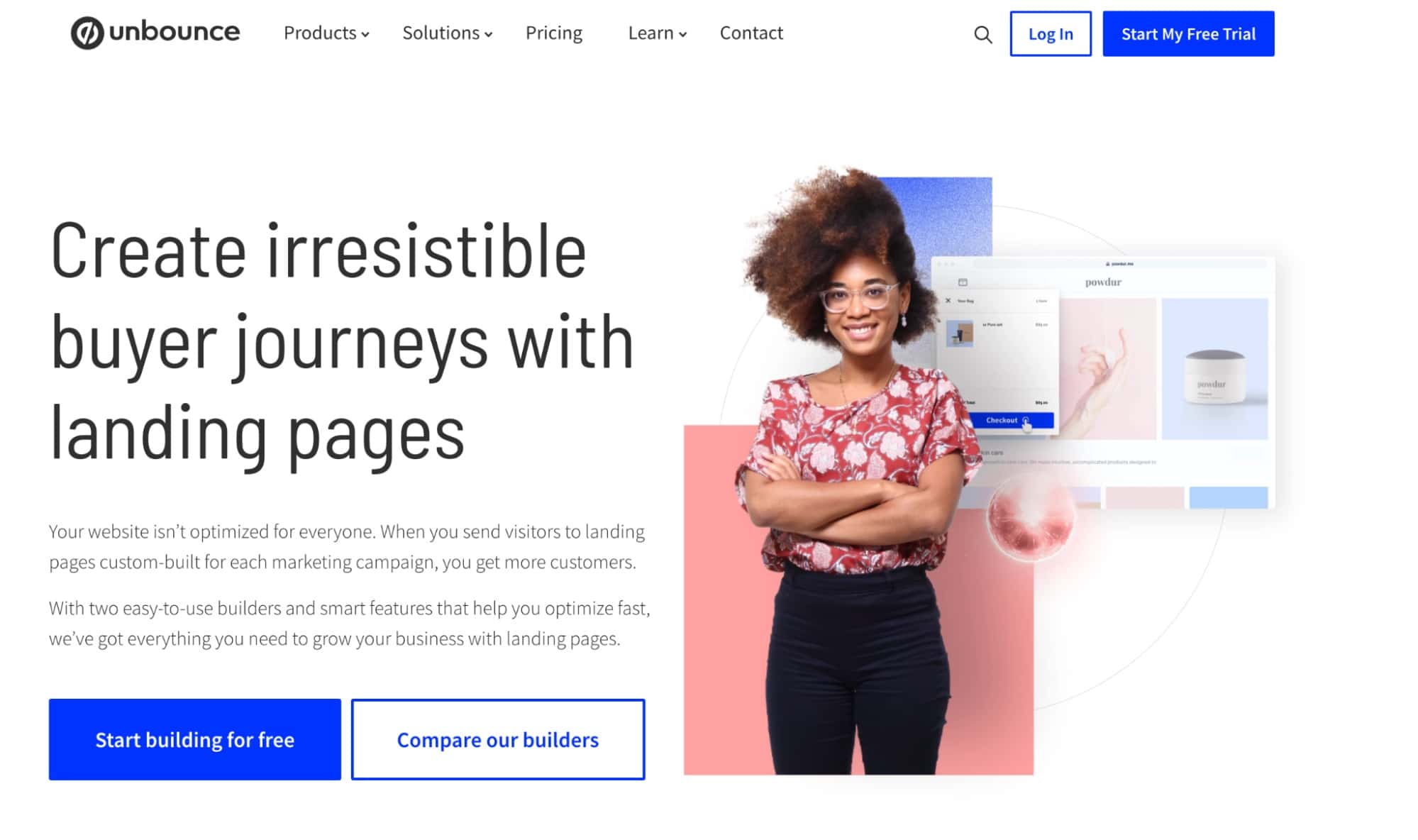
With Unbounce, you can edit your pages indefinitely without following any restrictions or grids. Additionally, you have access to more than 850,000 cost-free, high-quality images that you can use whenever and wherever you like to add to your landers.
For affiliates with more experience, it is possible to add unique JavaScript, CSS, and HTML to any webpage and to apply these unique scripts consistently across various landing pages.
Two-step opt-ins and form builders for lead generation are just two of Unbounce’s many practical features. Depending on your advance, there are four different plans with monthly costs of $80, $120, $200, and $300, respectively.
To Contents ↑8. Wishpond
Wishpond offers an all-in-one solution instead of dedicated software for creating landers. With built-in analytics, you monitor your campaigns in real-time. View information about page visitors, conversions, and each new lead generated by your campaigns.
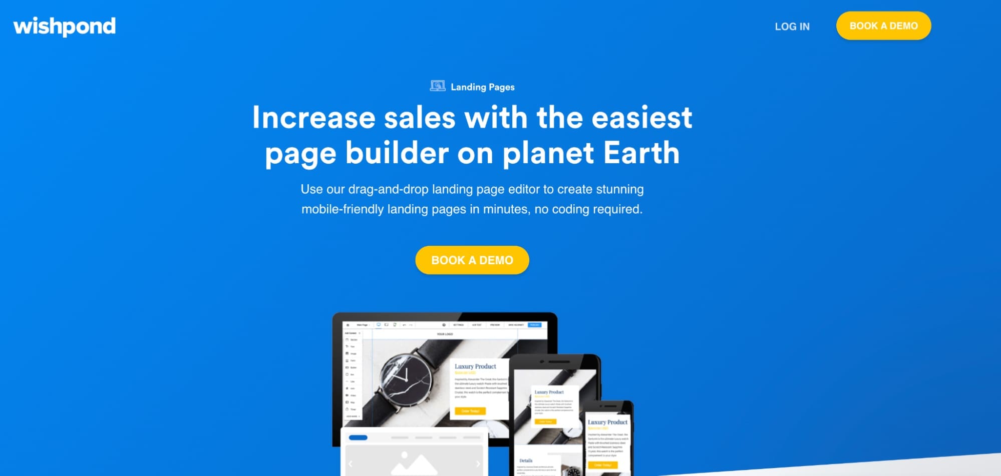
Using the built-in A/B testing, you can optimize your campaigns for performance. Set up A/B tests in a single click to test different messaging, images, videos, and more. Canvas powerful one-click mobile optimization feature allows you to align text and objects quickly, so they look great wherever they are. And more than 200 mobile-responsive templates!
Pricing starts at $49 per month (up to 1,000 leads). Everything You Need for $99 Per month (up to 2,500 leads). Rapid Growth $199-2,989/month (customizable from 10,000 to 1 million leads)
To Contents ↑9. Elementor
Elementor is a WordPress plugin for building web pages. Users can create landers using the drag-and-drop tool, compatible with any WP theme. The visual editor doesn’t require any coding knowledge to use.
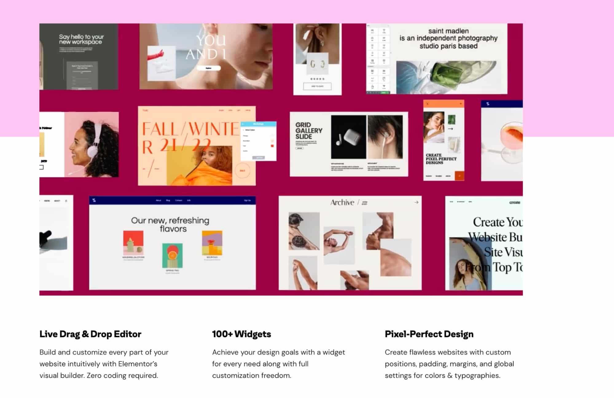
Popup windows are simple to create and configure to improve every page visitor’s experience. Elementor enables you to quickly and easily create an unlimited number of landing pages, ranging from short lead generation pages to lengthy, professional-looking advertorials.
This is the only free option on our list. But the free basic plan has some restrictions. More expensive options have annual fees of $49, $99, or $199.
To Contents ↑10. Landingi
Landingi has been praised for its user-friendly builder, 400+ templates, and dedicated thank you page creator that aids in completing the customer journey. Furthermore, smart sections ensure that any changes you make to a specific landing page section are automatically applied to similar sections on other landers.
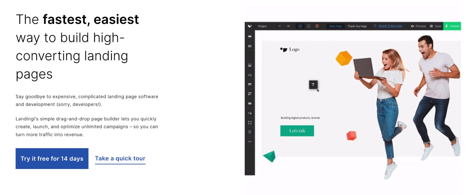
Landingi’s integration with Unsplash gives it an extensive image library. You can also edit your landers’ desktop and mobile versions to look great on both. Depending on your plan, you can add a certain number of custom domains.
Landingi’s pricing plans also limit the number of visitors per month. (For example, Landingi’s $79/month Create plan only allows 20,000 unique visitors per month.) If you get more than that, you’ll have to pay $5 per month for every 5,000 more unique visitors
Pricing: from $35 per month. Landingi.com offers a free trial.
To Contents ↑Affiliate landing page templates
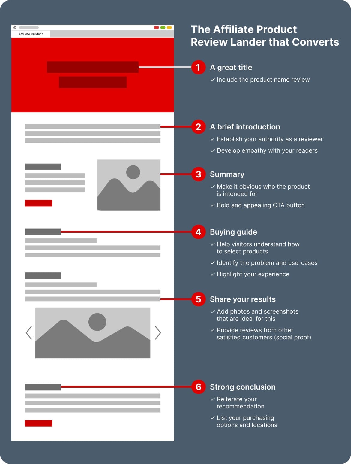
Before we finish, we’d like to share some tried-and-true affiliate landing page templates for your next campaign.
Conclusion
Even though Unbounce, LeadPages, and Instapage have the best LP builders overall, the right software for your business depends on your needs.
Your best builder depends on whether you want to sell memberships, improve lead generation, grow your email list, convert paid traffic, or sell more physical products.
No matter which software you use, landing page builders will help you increase conversions, lower your cost per acquisition, and improve your marketing campaign’s ROI — as long as you build them right. And make sure you’re getting the most out of your traffic by signing up for an Adsterra account today!
