A website’s bounce rate indicates how well or poorly people engage with the content (including ads) on a web page. For publishers and affiliate marketers, low rates lead to more targeted ad views and higher CPMs. And the higher your CPM, the more revenue you generate from your website. On the other hand, a session duration of 0–5 seconds may indicate technical SEO issues or poor ad formats and placement.
In this guide, we’ll go over why users leave immediately and how to lower your bounce rate.
What is bounce rate?
Bounce rate refers to the percentage of web visitors who leave a web page without taking any action, such as filling out a form, clicking on a link, or buying something. This metric is vital for these three reasons:
- Users who bounce from your website do not convert. So by preventing visitors from leaving immediately, you can increase the chances of them converting and becoming customers;
- A low bounce rate could be an important Google ranking factor. The longer people spend on your web page, the better the Page Experience signal to Google;
- A high bounce rate indicates that your site (or specific pages) has problems with its content, user experience, page layout, or copy.
What is an “average” bounce rate?
Custom Media Labs discovered that different types of websites had drastically different rates. Ecommerce websites have the lowest average rate (20–45%). In comparison, blogs have up to a 90% bounce rate.
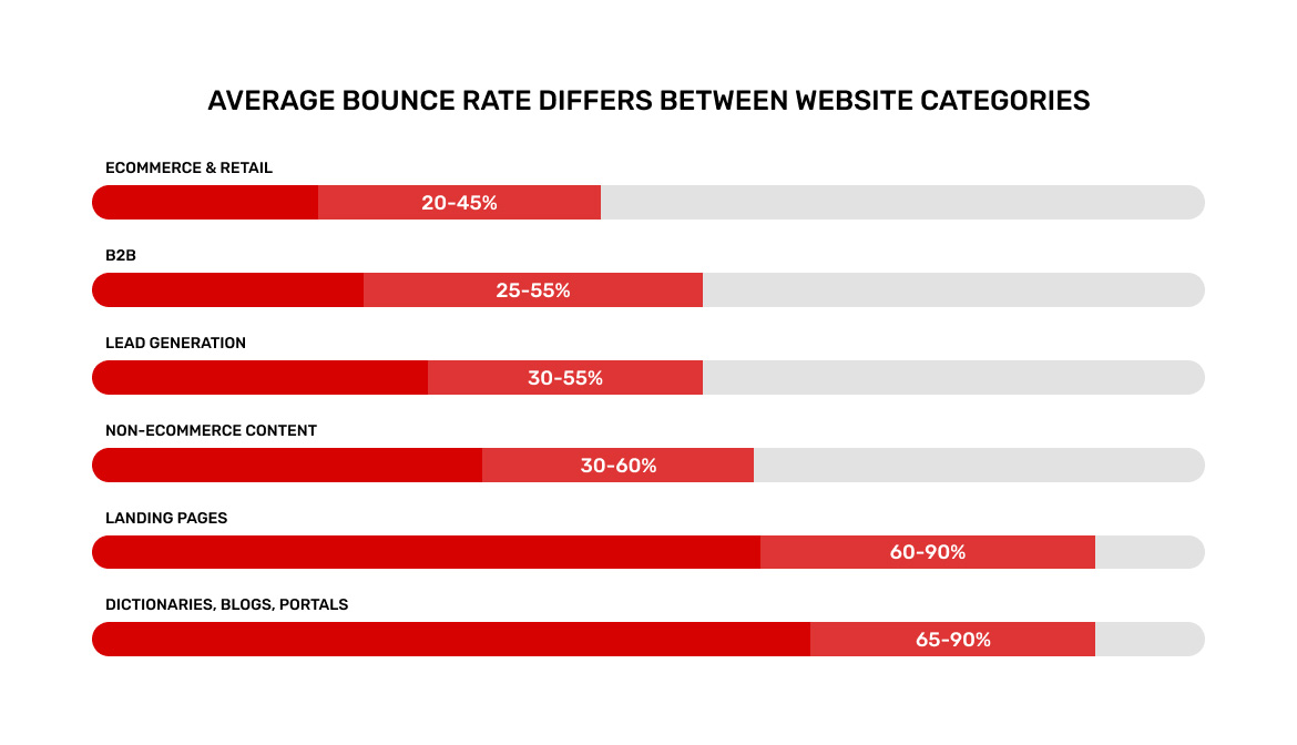
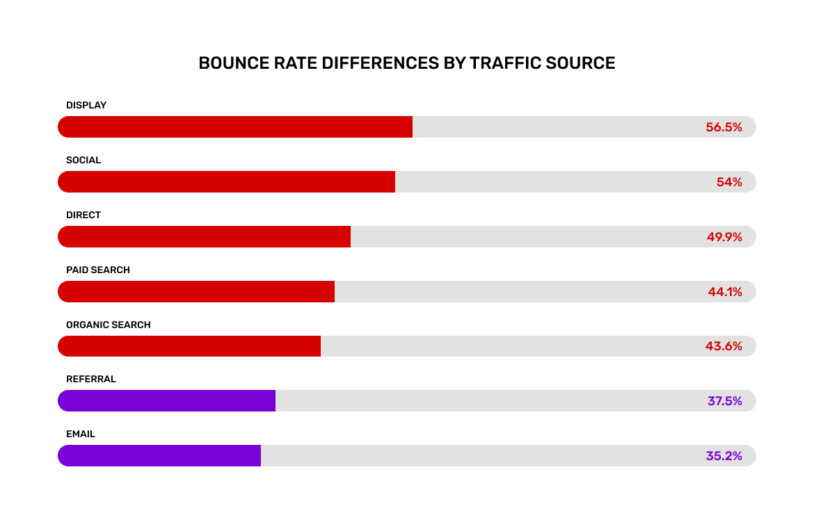
So, if you’re trying to figure out what a good rate is, compare your site to other websites in your niche. Furthermore, your site’s traffic sources can significantly impact your bounce rates. Traffic from email and referral sources has the lowest churn rates, while paid traffic and social media traffic often have a very high bounce rate.
Why do users bounce?
Before discussing how to lower your churn rate, it’s important to understand why people leave your site as soon as they get there.
1. Some web pages fail to meet the users’ expectations
Assume you’re looking for a new blender. So you search for “buy blenders free shipping.” You see an ad for “Blenders With Free Shipping” and click on it. But when you click on the ad, you’re taken to the website’s homepage instead of a landing page with various blenders.
What do you do then? You quickly return to Google search to find a page dedicated entirely to blenders.
2. The site’s ugly design scares off visitors
An ugly design can significantly increase your bounce rate. People will judge your website based on its design first and then, content. So, if your website is unappealing, you can expect a very high bounce rate.
On the flip side, a well-designed web page can make users stay just to admire its design and check the whole website out.
3. Poor user experience prevents visitors from converting
Your website must look nice and must also be extremely user-friendly. The easier it is for people to go through your web page, the lower your bounce rate will be.
Profitwise, website owners can improve ad earnings while decreasing the number of churns. While users hang around the website, they can see several ads and click at least one of them. It only means that a webmaster is likely to send more impressions and get higher CPM rates.
Advertising is somehow risky because ad codes can affect the page load time. Moreover, some ad slots look pretty cluttery. Choose a robust ad provider that serves user-friendly formats to remove those risks.
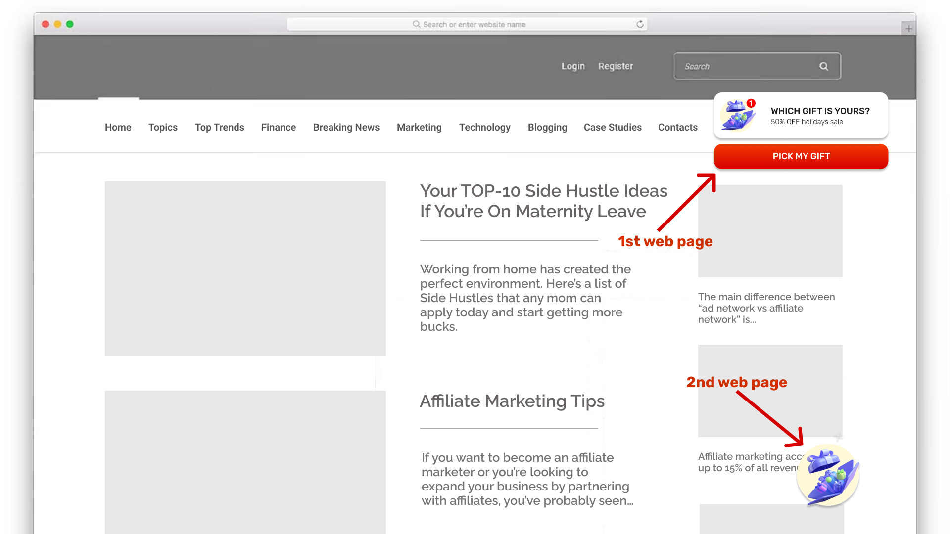
Adsterra allows for making a profit with ultra-engaging ad formats that will not harm your UX or critical SEO metrics, including bounces.
4. A well-packed web page is not enough to make users stay
Google very often shows 65–75% bounces for blogs precisely because readers read one article and leave. But they can read it for 20 minutes. Although this single-page session is technically a “bounce,” it’s not due to poor design or user experience, but because they got the information they need. There’s no reason for them to stay.
It indicates that providing the necessary information to satisfy user intent is just one piece of the puzzle. You should also make the webpage appealing for further exploration by adding internal links that lead to more interesting pages.
How to reduce your bounce rate
1. Add YouTube videos to your website
Wistia, a video hosting company, discovered that adding videos to their web pages more than doubled their average time on page. Furthermore, the data shows that pages with videos had a significantly lower (11%) bounce rate than web pages without videos.
Remember that these videos do not have to be yours; you can embed any YouTube video that makes sense for the page.
2. Improve page load speed
According to a Google analysis of 11 million landing pages, slow loading speed leads to higher bounce rates.
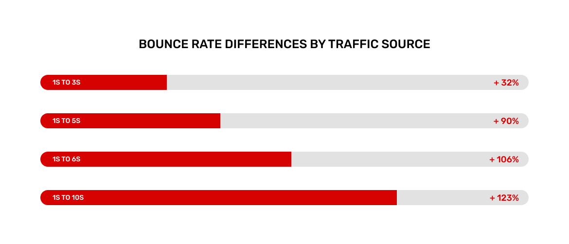
This should not be surprising; people on the internet have very little patience for slow-loading websites. Here are some suggestions to help you get things moving faster.
- Check out PageSpeed Insight recommendations (called “Opportunities”) to speed up your page;
- Images cause web pages to load slowly. Use an image compression tool (like Kraken Image Optimizer) to reduce the size of your images drastically;
- Use a fast hosting provider: your web host can affect the speed at which your site loads. So, if you’re still on a free plan, think about upgrading to a faster host;
- Remove unused plugins and scripts. Use WebPageTest to see a list of resources causing your page to load slowly and get rid of anything you don’t use or need.
3. Use the PPT introduction template
Many people decide whether or not to leave your page based on what they see “above the fold.” That’s why it’s critical to capture someone’s attention as soon as they land on your website. And the best way to accomplish this is by using the PPT formula:
- The first “P” stands for “Problem.” The introduction should urge the reader to continue reading. This is where you describe the user’s issue and explain why it must be solved;
- The second P stands for “Proof.” You provide proof that you and your content can be trusted. You can use your personal experience and credentials, customer reviews, or research results;
- Finally, T stands for “Transition.” Here, you explain what the post or article contains and how it will help the reader. You can then add a transition that acts as a CTA to encourage visitors to scroll down.
4. Make your content easy to read
Here’s how to make your content easier to read (and skim).
- Use a lot of white space around your copy;
- Break up long paragraphs into 1–2 sentence chunks to make them more skimmable;
- If the font is smaller than 15–17px, people will have to pinch and zoom on their phones;
- Use subheaders to divide your content into distinct sections. This allows people to read your content quickly.
Use illustrations, tables, and lists with bullet points and numbers. Well-formatted texts have a positive effect on SEO.
5. Fulfill search intent
Google is the most popular online traffic source. Therefore, your key content pages and landing pages must provide Google searchers with the information they’re looking for. A page that fails to meet Search intent is bad for your bounce rate. It’s also bad for SEO. Having a high bounce rate and a low dwell time can hurt your Google rankings.
6. Improve vital landing pages using heatmap data
Heatmaps are a great way to see how visitors use and interact with your website. This is important if you want to figure out why so many people are leaving your page. Our recommended heatmap tools are CrazyEgg and Hotjar.
Heatmap tools work the same way: you add a small javascript script to your website, and the tool will track how visitors read, click, and scroll through your page. Then you can collect and analyze the data to improve the user experience and CTA button placement on your site.
7. Add internal links on your page
You probably know that internal links are beneficial to SEO, and they help you improve your bounce rate. Why? Because internal links direct visitors to other pages on your website, which increases page views organically.
However, these links should be well-chosen and anticipate user behavior. Once someone visits another page on your website, they are no longer considered a bounce.
Pro tip: set internal (and external) links to open in a new tab.
8. Use tables of contents (via “jump links”)
Long-form content is the best way to get links and social shares for your content. Longer blog posts generate more backlinks than shorter blog posts.
However, one major issue with long-form content is that it’s extremely difficult to pinpoint a single tip, strategy, or step. And if visitors can’t find what advice they’re looking for in about 3 seconds, they’re likely to leave.
That’s where a table of contents comes in to help. A table of contents allows users to find what they need on your page instantly.

9. Optimize for mobile devices
With an increasing number of people accessing the web via mobile devices and Google favoring mobile, your site must be optimized for this type of traffic. A good site design is useless if a page takes too long to load on a smartphone, forcing users to look elsewhere for what they need.
10. Use clear CTAs
If you have strong, optimized content on a page, you should consider what action you want visitors to take. While you can have more than one CTA, having too many will confuse or turn people off and will not work. The placement of the CTA button on the page, color, copy choice, and size are all important. For example, Apple recommends that CTA buttons be at least 44 pixels tall.
11. Check your meta description
It is sometimes necessary to align expectations to reduce bounce rates. If your meta title, meta description, and page URL do not correspond to what you provide on a web page, visitors will leave. Your title and meta description should convince visitors to visit your page, and you must deliver what you promised in the meta.
12. Use exit-intent popups
You may have heard that popups can cause your bounce rate to increase. Popups that annoy and interrupt people are becoming increasingly unpopular. But there is another type of popup: the exit-intent popups that appear when someone is about to leave your page.

If that person is leaving anyway, you have nothing to lose by displaying a popup. Assume that 50% of your visitors leave your page, and you decide to put an exit-intent popup to the test. Approximately 10% of those who see the popup will enter their email address and convert. In addition, you will receive a large number of additional email subscribers as a bonus.
Bounce Rate FAQ
Here’s what Google considers the bounce rate:
“Bounce rate is the percentage of all sessions on your website in which users viewed only a single page and triggered only a single request to the Analytics server divided by the number of single-page sessions.”
In other words, it gathers all sessions in which a visitor only visits one page and divides them by all sessions.
A high bounce rate can indicate one of three things:
1. The web page’s quality is poor. There’s nothing interesting to interact with there.
2. Your audience does not match the purpose of the page so nothing on the page makes them interested in exploring your website
3. Visitors find the information they are looking for quickly and leave after reading it.
A bounce rate of 26 to 40% is considered excellent. The median rate is roughly 41 to 55 %. 56 to 70% is higher than average, but this may not be cause for concern depending on the website. Anything higher than 70% is disappointing for every type of web page except blogs, news, and events.
Here are a few factors that affect your website’s bounce rate:
Load speed;
Poorly designed interstitials or popups;
No Call to Action buttons;
External links;
Poor formatting or visually unappealing content (e.g.: no paragraph breaks and white space);
Confusing menu structure;
Misleading titles and meta descriptions.
Conclusion
You can use the bounce rate to determine which pages require additional attention. Making your pages more appealing to visitors leads to a decrease in the bounce rate, longer duration of page views, and the opportunity to earn more from ad impressions with Adsterra.
