In the Insider Advice sessions, Adsterra experts break down challenging issues that our advertisers and publishers face. Each month we estimate the number of queries via chats, Skype, and emails and prepare a handy set of tips on one specific topic. This time our Head of CPA Aina is here to shed some light on ad creatives.
So, today’s tips and hacks will flock around “Where to get advertising creatives that make users click and how to tune them up for conversions”?
Hi everyone! I’m happy to open the series of posts based on your questions and concerns. We’ve been getting loads of questions about visuals and ad copies. What I’m going to tell you about today is how you can apply simple practices to choose and tune up your creatives for higher CTRs. In other words, we will see how affiliates and advertisers can organize a flawless work on producing resultative visuals and copy for their adverts. Spoiler — it’s all about a set of actions, tests, and a bit of technology. So let’s go!
Aina S, Head of CPA at Adsterra
Contents
Where to find ad creatives: sneaky affiliate marketing techniques
4 tips to help you find ideas for your creatives faster
What ad creatives hit depending on the format
– Tips for web push and in-page push visuals and copy
– Tips for custom Social Bar creatives
– Hacks for native banners creatives
How to make truly competitive ad creatives for affiliate campaigns
– iGaming vertical and its main triggers
– Messages and designs for dating affiliate campaigns
– Ad creatives for sweepstakes offers
– Affiliate campaigns with gaming creatives
– Hacks for Utility, VPNs, Cleaners creatives
TOP-10 tips checklist to tune your creatives for higher CTR and conversions
Summing up
Where to find ad creatives: sneaky affiliate marketing techniques
Ok, you’ve set up your GEOs, chosen ad formats, and tweaked targeting. The most exciting part of the job is in front of you. How to get to your audience? What visuals will convert better?
The main point here is that most of us are trying to reinvent the wheel when it is not needed. Here is the set of bulletproof actions to do your job faster and with ease.
4 tips to help you find ideas for your creatives faster
- If you launch a campaign with Adsterra, never hesitate to ask your manager on what’s trending now in your segment. We monitor the market 24/7/365 and will stream you tons of insights in connection with agenda, post-COVID trends, etc.
- When working with a direct advertiser, always ask for high-resolution images and product profiles. CPA networks provide affiliates with useful image sources from advertisers. Join their public pages and chats and catch all useful info.
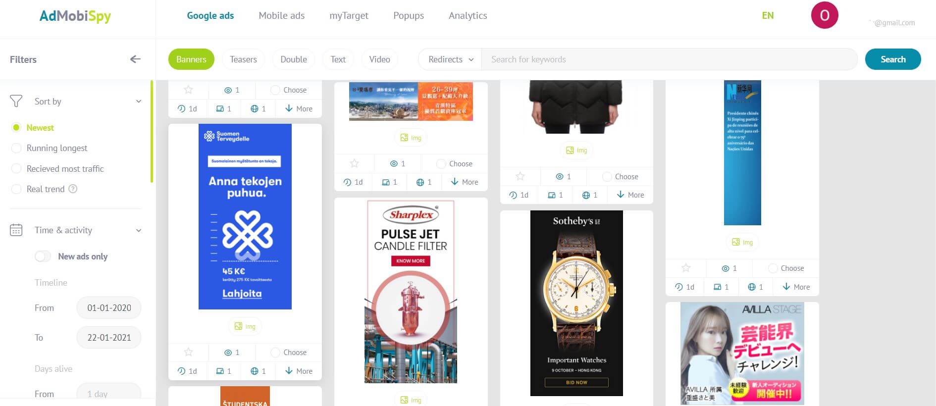
- Use helpful spy tools and creatives’ storages to find inspiration and nice marketing tricks. Adplexity spy tool selects the best-performing in-app, pop, push, and other creatives from many ad networks.
One more example is AdMobiSpy. It tracks ads from over 180 countries on the largest ad networks and exchanges.
But remember. Each second, thousands of affiliates examine the very same creatives and ideas. So use those spy tools only to make up a concept or catch a couple of tricks, not to copy the visuals.
When searching for images of people,try to avoid this overused photo stock stuff. Sources with more or less natural photos can help you out there: Unsplash, Pexels, Kaboompics and dozens of non-glossy photo assets.
What ad creatives hit depending on the format
We can’t talk about visuals in vacuum. They’re tightly connected with verticals and advertising formats. And they must fit like a glove. Let’s see some common tips for the most demanded ad units.
Tips for web push and in-page push notification creatives
Push ads, both web and in-page, are literally notifications, so they must …notify and grab attention 🙂 And you have one or two visual components for that: icons and larger pictures.
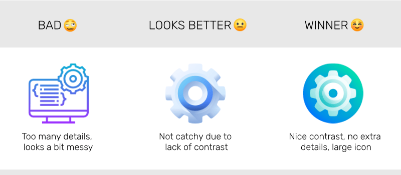
 The icon must be catchy or meaningful, or both
When it comes to, say, cleaners, boosters, VPNs, anti-viruses, users shall detect the product. Try not to pick outlined icons that look like templates and are too detailed.
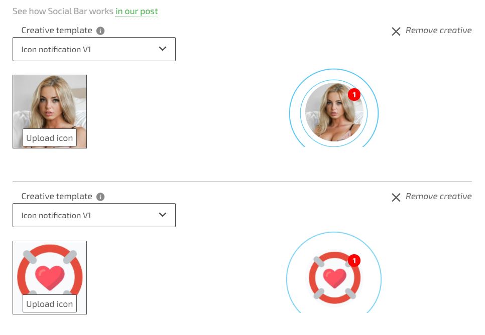
 For dating and social services, it is worth using faces instead of icons
As you probably know, Social Bar provides you with battle-tested creatives layouts for in-page push ads. You only need to apply a proper image or picture on them. In many cases photos can be your top choice.
Icon notification is the simplest ad format with a circle animated icon and a “1 new message” sign. Adding a photo can help you leave competition in the dust. Compare these two, which is better?
 Make your push ads’ design credible and add value
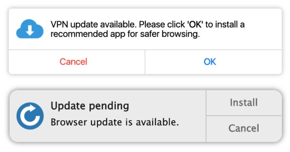
All you do with design and illustrations should be more than just a decoration. Make ad creatives speak about your offer, add value and importance. If it is a browser extension, or PC cleaner, make design look like a native part of the OS notification. If it is a sportswear sale, use discount badges and price drop proofs.
 Let your visuals marry to your ad copy
Here is one important thing. Creatives come hand in hand with your ad copy. And texts highly impact your visuals especially in web push ads.
Your texts should be short and clear stating the urgency, importance, and value. “Free up to 80% your phone storage” looks like a value while “a new powerful phone cleaner” doesn’t. “Your device needs protection” states the general truth but looks credible, while “We detected a virus on your PC” is a misleading false alarm.
Tips for custom Social Bar creatives
Social Bar is the only format on the market that is fully customizable.You can even add a conversational scenario, making it ask and answer users’ questions. Seems tempting? Sure it is! But the more options you have the harder to make an integral and powerful creative.
What we recommend here is to not make things overcomplicated. Stick to one idea that grabs attention. It might be really on the surface.
Let’s check some examples.
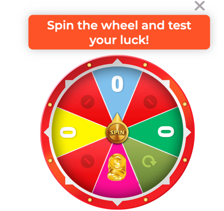
For iGaming offers, use energetic colors and powerful CTAs. Your users must believe they will hit the jackpot. Add animation like a lever to pull or a slot-machine screen. It works!

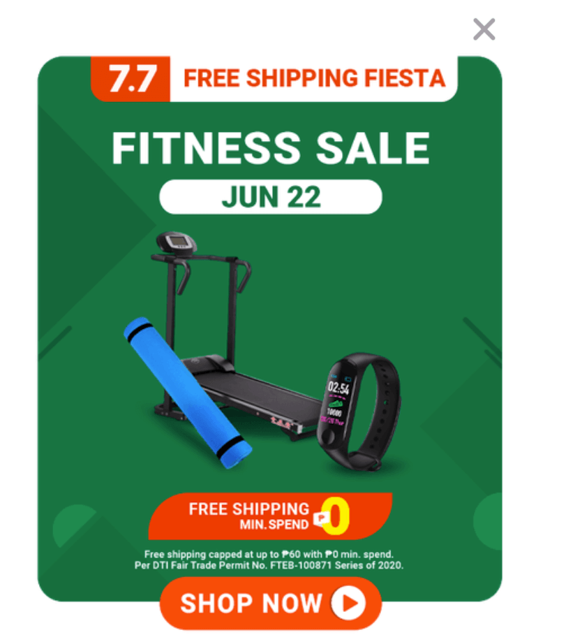
With E-commerce ads, you may tease with discounts and secret bonuses to unlock. Add information about shipping. Use time counters and mention the scarcity. Encourage your users to buy by showing them real products.
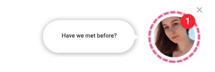
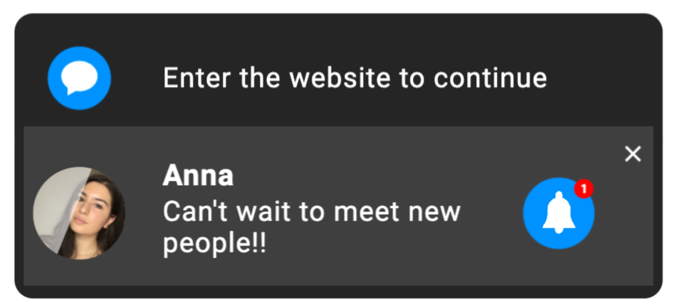
It’s great when Dating ads look and sound like a private chat message or a teasing invitation. Use questions to engage in the dialog. Use all those elements that make your creative look like a real personal message.
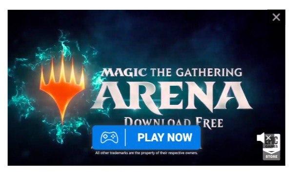
For Gaming offers, use videos that allow showing the best game moments. It runs like a push notification and isn’t attached to video players. Or, create a teaser with the game’s character.

Hacks for native banners creatives
People meet native banners within editorial content. As they dive into reading a next celebrity gossip or a gadget review, you need something very powerful to drag their attention to your ad.
Create a teasing copy that leaves readers speechless, make them feel curious, or offer a magic pill or sensation. Real-life stories or testimonials also help win hearts. Ego-challengers and all those ‘This quiz shows your IQ as it is’ hook users and make them click.

How to make truly competitive ad creatives for affiliate campaigns
Each advertising campaign challenges you to think of what your customers wish, expect or desire the most. And you need to give it to them with a clear message. Depending on the vertical and the offer, affiliates can add different messages to their creatives.
 iGaming vertical and its main triggers
Making creatives for iGaming offers, think of presenting stories of a great success and payment proofs; offer secret rewards and bonuses. Creatives should be promising, emotional (when it comes to real-life stories of the winners), vivid, festive. Use the FOMO technique to make users feel they’ll miss something huge if they don’t use this chance asap.

 Messages and designs for dating affiliate campaigns
Here you create a sense of excitement and trust at a time. Make people believe someone thinks of them as of the best match. Use photos that look like profile avatars rather than glossy magazines’ photos. Hook with native formats like chat icons, speech bubbles, notifications, video streams.
 Ad creatives for sweepstakes offers
Sweepstakes still rock with the same old ‘lucky money’ messages. Banners and push notifications with “claim your bonus”, “get 10 welcome bonuses”, “you can win” attract thousands of fortune hunters. But don’t lie, or conversions will disappoint you.
 Affiliate campaigns with gaming creatives
It’s great when visuals and ad copy for gaming campaigns challenge users and promise new exciting experiences. If you can give a sneak peak to a new game, create an impression of being there, touch and taste it, your CTRs will skyrocket.
Watch the game trailers, ask your advertiser for more facts, read the latest reviews. If you see juicy facts like ‘top-ranked’, ‘downloaded over 15 million times’, you’ve found your goldmine!
 Hacks for Utility, VPNs, Cleaners creatives
Affiliate marketing campaigns with VPNs keep growing in number. Competition is tough, but you can win following simple rules. State real values like privacy protection, data safety, productivity increase. Give a hint about possible risk and dangers when advertising antiviruses. Stress that the offer will expire soon to warm up target actions.

Checklist: top-10 tips to tune your creatives for higher CTR and conversions
- Always remember about the consistency. It’s crucial when creatives, pre-lander and lander match in design and messages. It makes your ads more credible.
- Remember matching the headlines and ad copy with the language of the country where you run a campaign.
- Use realistic images of people, avoiding overused and airbrushed stock photos. Your creatives should be trustful.
- Use customized creatives with interactive elements. Social Bar opens huge opportunities here. Chat-like banners, fortune wheels, slot machines…The choice is limited by your imagination.
- When it comes to seasonal sales, special offers, limited trials, create a sense of urgency. Countdowns know their job! Ad copy may contain constructions like LIMITED OFFER, SALE ENDS IN…, ONLY 10 ITEMS LEFT.
- Catch up with the agenda. Sometimes you don’t need to change ads, just to mention a forthcoming holiday or event. Compare “Great sportswear sale” vs “Thanksgiving sportswear sale ends in 2 hours”.
- Don’t forget about a powerful CTA. You really need users to act, so “Learn more” is a weak example.
- Keep the balance between great CTRs and further CRs: installs, trials, opt-ins. Your final goal is conversion growth, not the CTRs. So avoid misleading or promising something that users won’t obtain.
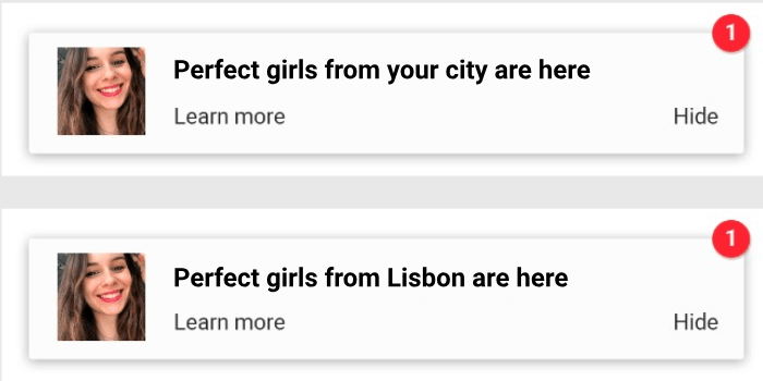
- Personalize ads. Log in and ask your Adsterra manager for special dynamic tags you can use to change languages, cities, and countries depending on your target. Just compare these two ads. Which one is going to win the day for a user from Lisbon?
10. Always test your creatives. You can use all visual elements as well as the copy: headlines, icons, images, CTA buttons, descriptions. But not at once! Come up with an element you want to check and make up several versions where it differs greatly.
Summing up
Okay, it seems like we’ve broken down some typical challenges and questions about how affiliates can make ad creatives that convert. Of course, this was a set of recommendations, not a full guide (shall we publish one?).
Your Adsterra managers and our in-house Design Studio are restlessly monitoring visual trends and advertising tricks to deliver you more insights each day. Never doubt to ask if you’re not sure what creative to pick and how to trigger your audience.
Hope this post was helpful! Thank you for reading till the end.
What if you could grab battle-tested layouts for ad creatives avoiding long search? You can. Create a Social Bar campaign and test them all
 The icon must be catchy or meaningful, or both
 iGaming vertical and its main triggers
 Messages and designs for dating affiliate campaigns
 Ad creatives for sweepstakes offers
 Affiliate campaigns with gaming creatives
 Hacks for Utility, VPNs, Cleaners creatives